Category
- Styles, themes and colors
HTML Cards for Advanced UI
Use HTML cards for a flexible and responsive presentation of data with limited coding.
The HTML Card Builder has a coding panel and a preview panel. There are two kinds of layouts for these panels – vertical and horizontal.
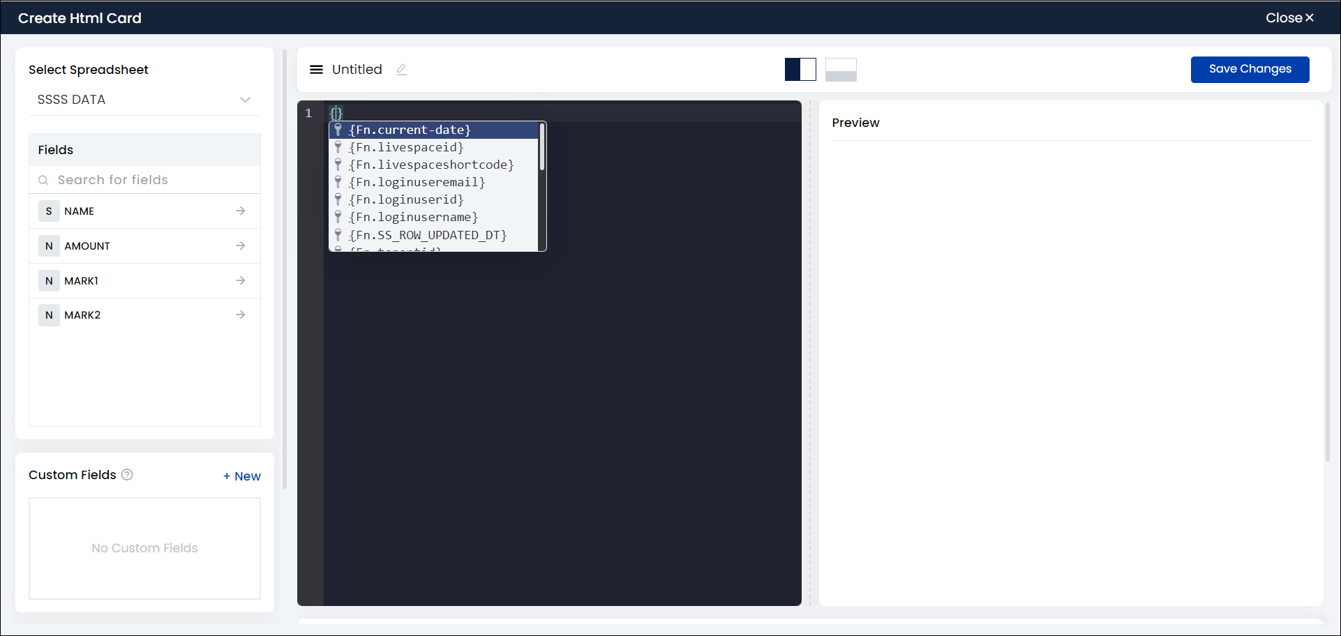
You can write the code and call the variables or fields from the coding panel itself. You can search for internal variables and use them directly in the source code.

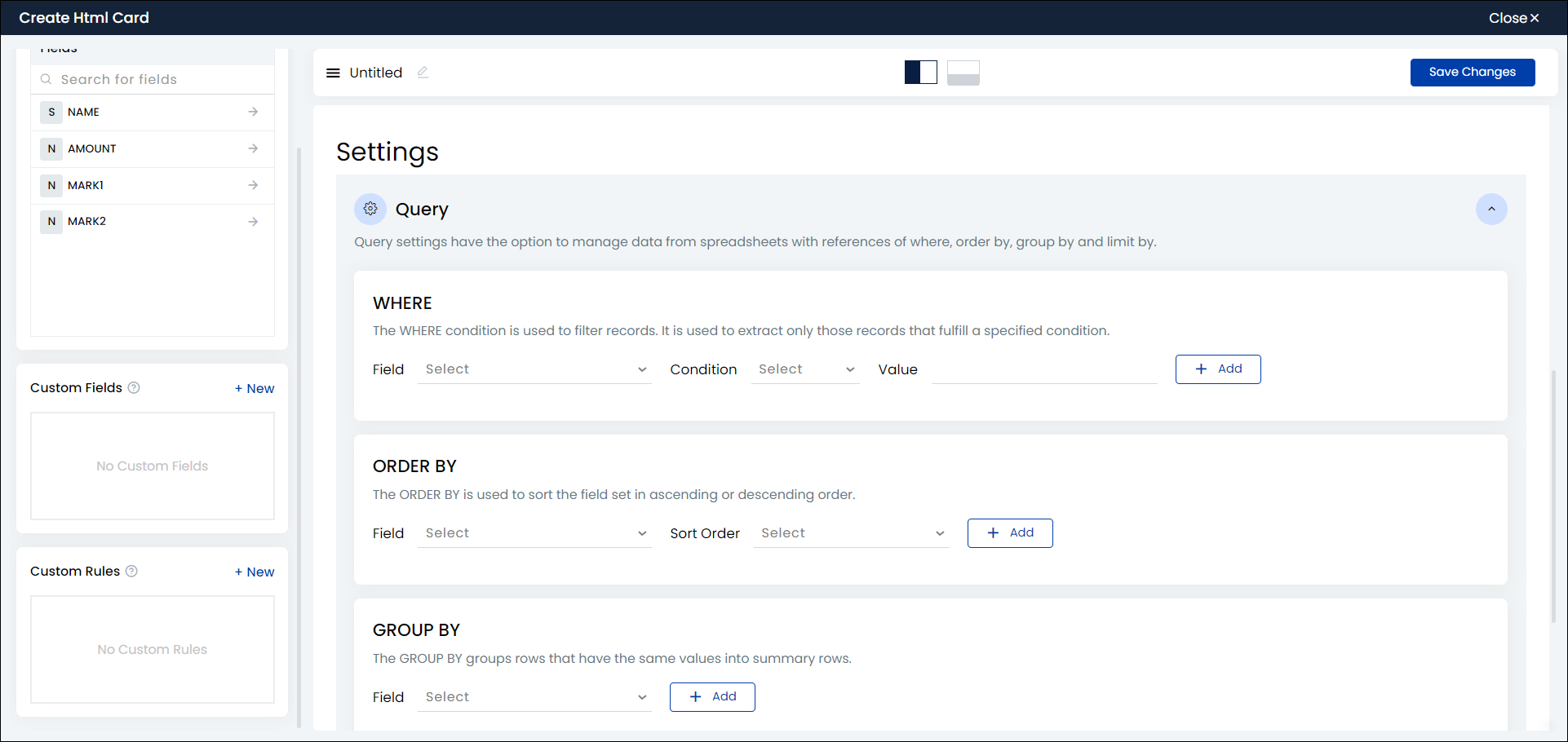
As you scroll down, you can find the Settings option. Under Settings you can find the Where, Group by, Order by, and Limit by options.
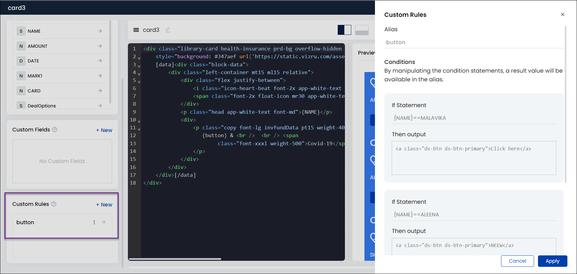
You have a new option Custom Rules that enable you to get an output based on conditions. That is, it enables you to execute a certain code if a condition is true and execute a different code if the condition is false.
Click + New to add a custom rule. A sliding panel is displayed on the right where you can give alias names and conditions.
- Reload option in HTML cards: This feature is available only in specific portals. This feature allows to reload an HTML card in real time.
- Custom DNA filter values: You can filter specific data in all elements using data-dnafilter = ’field/value’ within an HTML card.
Multiple [data] tag and [nodata] tag in HTML card builder
[data] tags can be added multiple times to the source code of an HTML card. That is, wherever we need to set dynamic variable, we can wrap it with [data] tag.
For example, 1. <input type=”text” name=”fname” value=”[data]{name}[/data]“>
2. [data]<span class=”abc”>{name}</span>[/data]Also, a [nodata] tag can be used to display content if the field within the [data] tag is empty.
Also, a [nodata] tag can be used to display content if the field within the [data] tag is empty. That is, if any column doesn’t have any records, and we need to display some other content, then we can use [nodata] tag. If the value is null in the spreadsheet same will work in dashboard filtering case also. For example, suppose SS contains a column as ‘Customer’. Initially it has no data. At that time we need to display a button for adding new customer/set some messages.
1. [data]<span class=”abc”>{customer_name}</span>[/data][nodata]<button>Add New Customer</button>[/nodata]
2. [data]<span class=”abc”>{customer_name}</span>[/data][nodata]No Customers Exist[/nodata]
.jpg)
Note: Data can be passed dynamically to the [no data] section through the init workflow. Inside the dashboard rule block, you can select the action as “Set static variable”, define the variable and value, and then in the HTML card, call the variable to the [no data] section.
- You can set a limit for the number of data you want to display in an HTML Card. For this, give the limit value within the data tag as shown in the screenshot below.
.png?authuser=3)
- Component filter: The fields of a grid or a datalist can be set as a dropdown in an HTML card and used for filtering data. This is done by adding the field name and corresponding grid or datalist shortcode to the source code of the HTML card.

To display numeric fields with commas and decimal points, insert the following code:
class="viz-numeric-input" data-format="0,0.00" name="<name>" value="{field}"

To expand and collapse content (Read More/Read Less) in HTML cards, use the attribute “viz-stripheight” in the following format:
<viz-stripheight height="190px" btntext="Read more|Read less">
[data]{description}[/data]
</viz-stripheight>

Adding Smart Dropdown for HTML Cards
- You can add smart dropdown in HTML cards. Smart dropdown is an enhancement of the dropdown feature wherein a datalist can be added as a dropdown. For this, specify the shortcode of the datalist and the name of the particular field within the source code of your HTML card.
.png)
.png)