Category
- Building Smart Apps
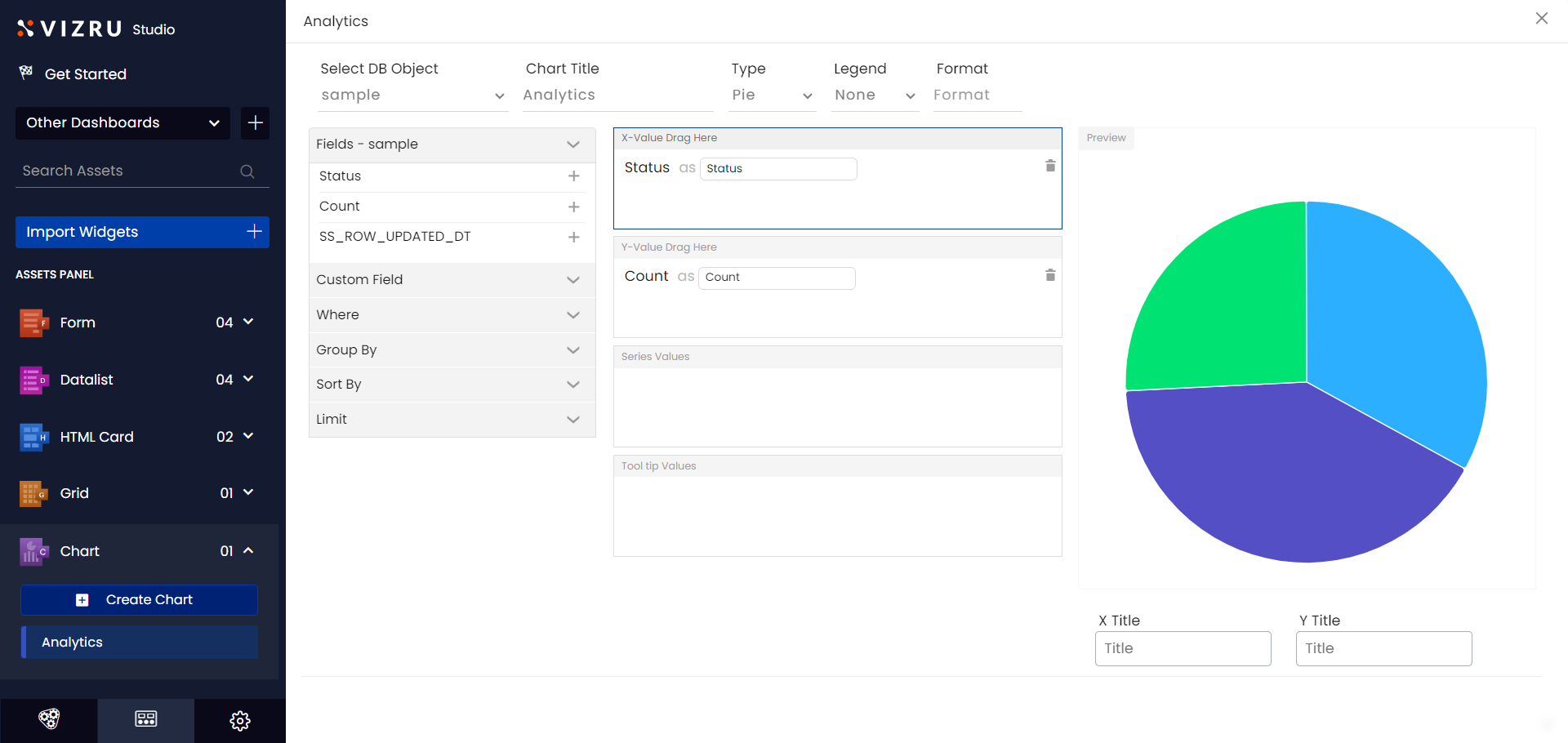
Creating a Chart
A chart is a visual analytical representation of spreadsheet data.
Creating a chart
- Go to dashboard studio and click Chart > Create Chart.

- The following page is displayed.

- Select the object or source spreadsheet from the dropdown list and enter a suitable title for your chart. The fields of the selected spreadsheet are displayed in the left pane.
- Click the
 icon for the fields to add them to the X-value and Y-value fields as required. Choose the chart Type from the dropdown list.

- Choose Legend as Basic for normal view, Minimal for no X-axis and Y-axis values displayed, Total for displaying the total count of Y-axis values, and Average for the average of Y-axis values.

- Click Save & View. You get a preview of the chart in the Preview panel.
Configuring Chart Settings
You can configure various chart settings such as group, sort, limit, etc.
- Click Where from the left pane, enter Field Name and Value, and click the “+” icon to filter or narrow down your search data within the chart.
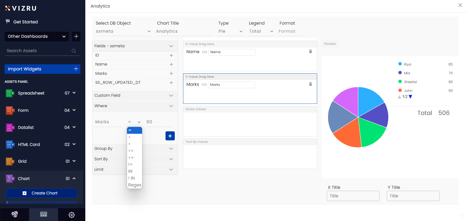
In the below example, the chart displays data with Y-axis values greater than “80”.

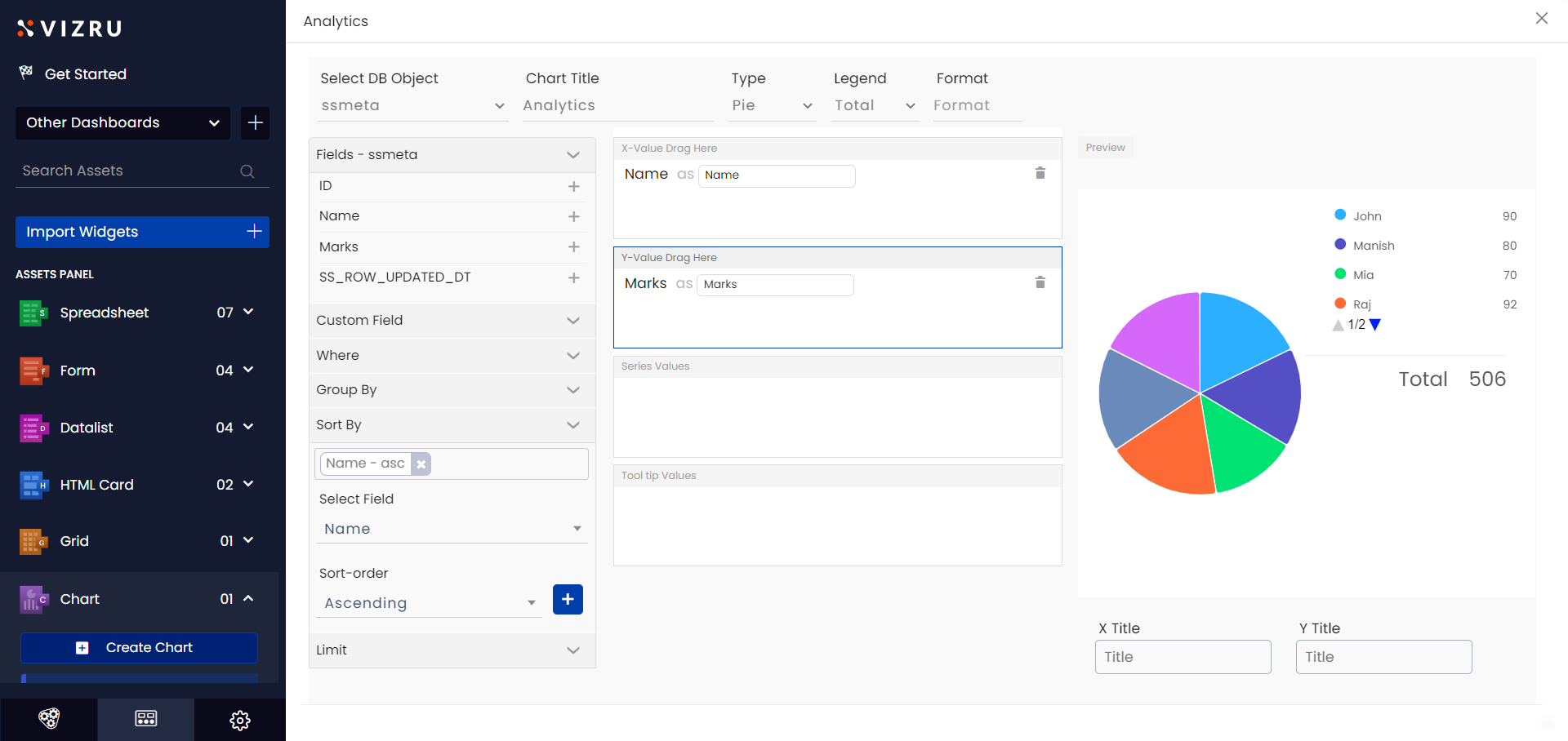
- Click Sort By from the left pane, choose the Sort-by field and Sort-order from the dropdown lists, and click the “+” icon to set a default sort order of the chart data. The below example shows all the names arranged in ascending order.
- Click Limit from the left pane to set the number of entries you want to display. In the below example the limit is set to 4 and the chart shows 4 entries.

Using Custom Field and Group By
You can group data based on a particular field and get the count of such groups using Custom Field and Group By settings. The following procedure explains getting the count of males and females in the chart.
- Select Gender as the X-axis field.
- Click Custom Field from the left pane, enter Field ID as “count(Gender)”, select Add to Y, and click “+”. The field gets added as the Y-axis value.
- Click Group By from the left pane, select Gender from the dropdown list, and click the “+” icon. You get a preview of the chart showing the count of males and females.

Creating Smart Charts
You can also build charts using HTML cards. You can specify the style, that is, height and width of the chart and data within the source code of the HTML card.

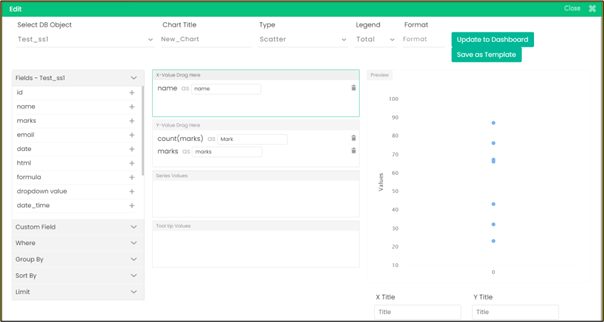
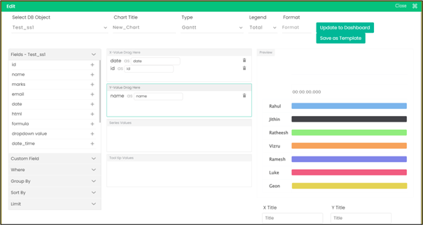
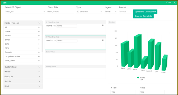
- You can create new types of charts also such as Pyramid, Scatter, Donut, Semi Donut, 3D Column, 3D Pie, 3D Donut, and Gantt. For all chart types except Gantt and Scatter, give string values for the X axis and numeric values for the Y axis.
For Scatter type, you have to give a string value for the X axis and two numeric values for the Y axis. For Gantt chart, you have to give two date values for the X axis and one string or numeric value for the Y axis.