Category
- Building Smart Apps
Datalist
Datalist is a powerful UI element for the tabular representation of a large amount of data.
Creating a Datalist
- Open the app you have created and go to Dashboard Edit.
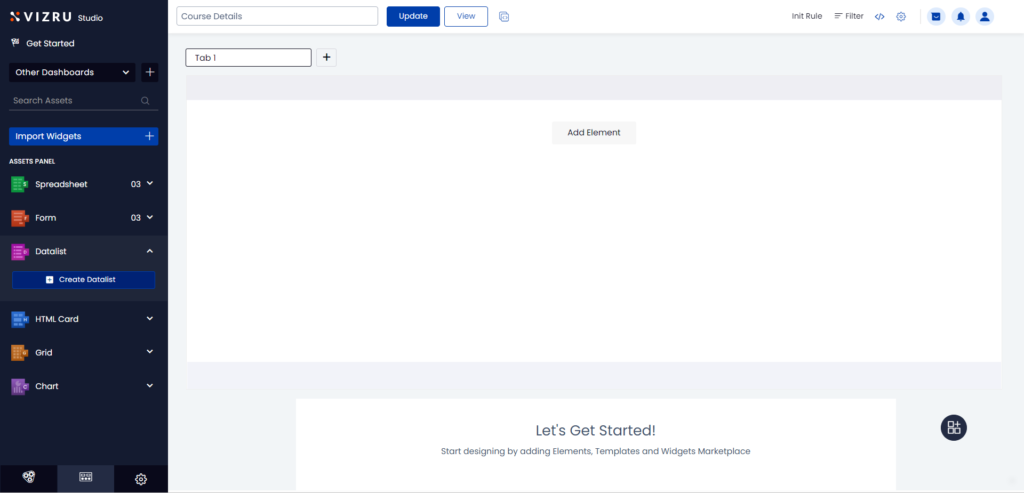
- Click Datalist > Create Datalist from the left panel to create a new datalist.
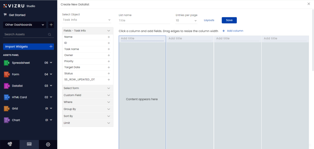
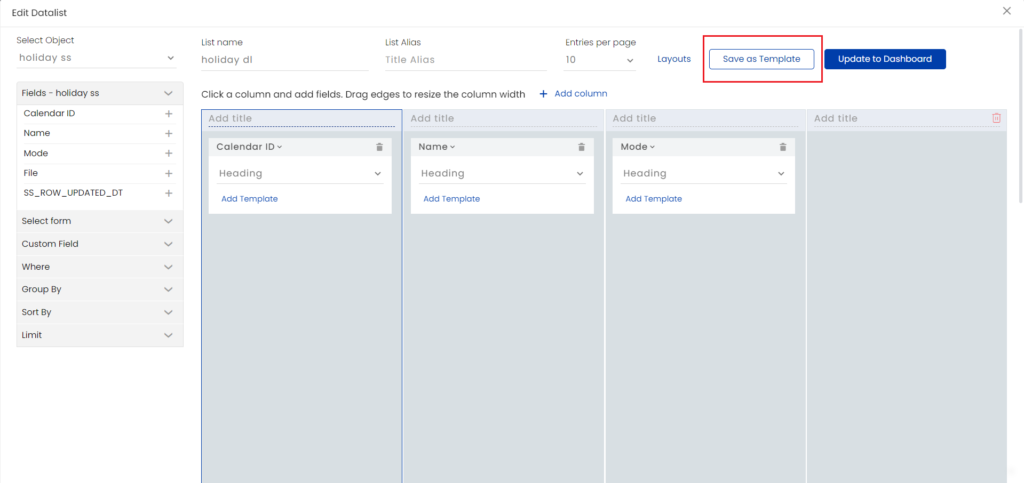
- You can choose a layout or template for your datalist from the datalist library. For that click Layouts and click Apply for the template you want to use.
Note: The stable version of the datalist templates library is stored in apps.vizru.com. It can be imported to a tenant and customized for an app.
- Select the source spreadsheet from the dropdown list, enter a suitable title for your datalist, and choose the number of Entries per page, which sets the number of rows to be displayed in the datalist. The fields of the selected spreadsheet are displayed in the left pane.
- Select a column and click the
 icon for the fields you want to insert within that column.

Note: There is no data loss on switching the source spreadsheet. After configuring your datalist if you switch your source spreadsheet, the datalist will still retain the data you have saved. The design template is also saved and you can manually change the data of your datalist.
- Click + Add column to insert additional columns.
- You can add a title to each of the columns in the datalist.
- Click the dropdown arrow for any field to set a style for the field value.
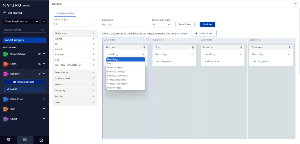
- Click Add Template to give custom styles to the field value.
To display numeric fields with commas and decimal points, insert the following code:
class="viz-numeric-input" data-format="0,0.00" name="<name>" value="{field}"
- You can drag and drop fields between columns.
- You can also choose spreadsheet fields from a dropdown list within each column of the datalist. This way, you can switch between fields easier.

- You can connect a form to the datalist. For this, click Select form from the left pane and choose the form you want to connect to the datalist.

- Finally save your datalist.
- Once you save your datalist and add it as a widget on the dashboard, you will have the option to save your datalist as a template.
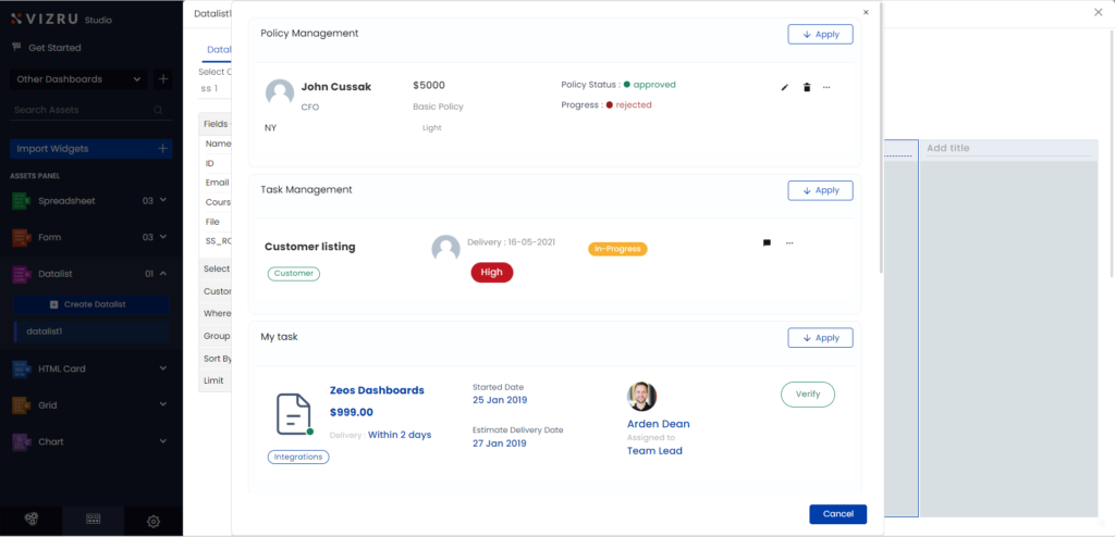
Creating action buttons in a datalist
You can add action buttons to a datalist and connect to appropriate workflows to trigger actions on button click.
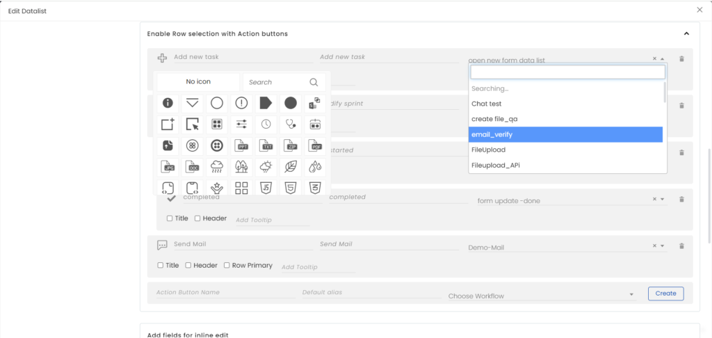
- Give a name to the action button, choose an icon, give alias name for the button, select the appropriate workflow from the dropdown list, and click Create.
- You can set different positions for the action button. The action button can be placed on the header, along with the title, or within a row. You can add tooltip as well to the action button.
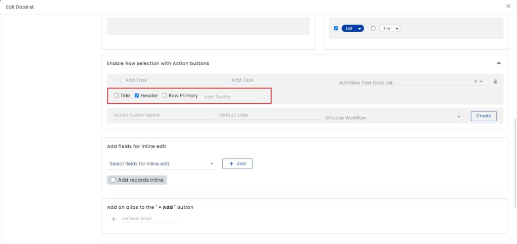
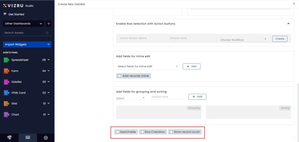
- You can choose to enable or disable search within your datalist and also opt for checkboxes for every row. For this, select the checkboxes for “Searchable” and “Row Checkbox”. To display the count of records in the datalist, select the checkbox for “Show record count”.
Inline Datalist Editor
With this, you can edit a record or add a new record in a datalist in real-time, without using the form.
To enable the inline editor, open the Datalist Builder page, go to the option “Add fields for inline edit”, and select and add the fields you want to edit inline. To add a new record without using a form, select the checkbox for Add records inline.
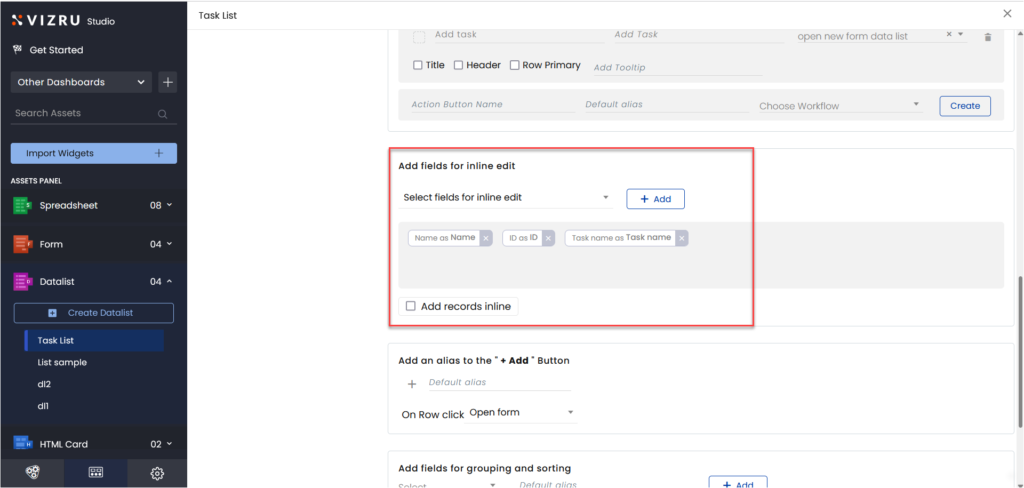
Update and view your dashboard. Inline edit will be enabled for the fields you have selected.

You can group datalist records based on a specific field and add a new record for the group in real-time.
Select the field for grouping from the dashboard. The Add records button will be visible on the mouse hover.
.jpg)
Click the button to add a new record.
.png)
Custom date formatter
Custom date formatter: Custom date formatter helps you add custom date formats in dashboard elements, irrespective of the format in the source spreadsheets.
- For this, open the Datalist Builder page and select Custom Field from the left panel.
.png)
- In place of Field ID, type in “vizdate(field name, date format)”.
- In place of the Field alias, type in the custom field name.
- Click Supported formats to view the different date formats available.
.png)
- Click Add. The custom field set is displayed in the Custom fields
.png)
- Click Add Template for the field you want to set custom date format. The following pop-up is displayed.
.png)
- Specify the custom field name and click Update.
.png)
The date format is now customized in the datalist.
- If you are adding a date field for Group by, you have the option to group as weekly, monthly, or yearly.
.png)
- Workflow custom functions in datalist: You can add workflow custom functions to datalist. You can add them either using Add Template below the field or using the option Where in the left panel.
.png)
- Login user email on datalist: You can get the details of the login user in a datalist by adding a template {loginuseremail} to the field or by adding a filter for the email with {loginuseremail}. This feature helps to get the details of the users logged into the specific datalist.
.png)
.png)
Datalist View Mode
You now have two view modes for the datalist: List and Grid. You can select either one or both the modes. You can also adjust the width of the column.

On selecting both the modes, you get an icon on the dashboard. Click the icon to switch between the two modes.
.png)