Category
- Release Notes

ZEOS, Version 30.0.0
Release Date: 19/07/2023
About This Release
Release 30.0.0 brings major features such as dashboard widget marketplace, improved form builder UI with enhanced functionalities, and enhancements to workflow blocks and platform design. It also fixes bugs related to workflow blocks, HTML cards, and datalist.
New Features
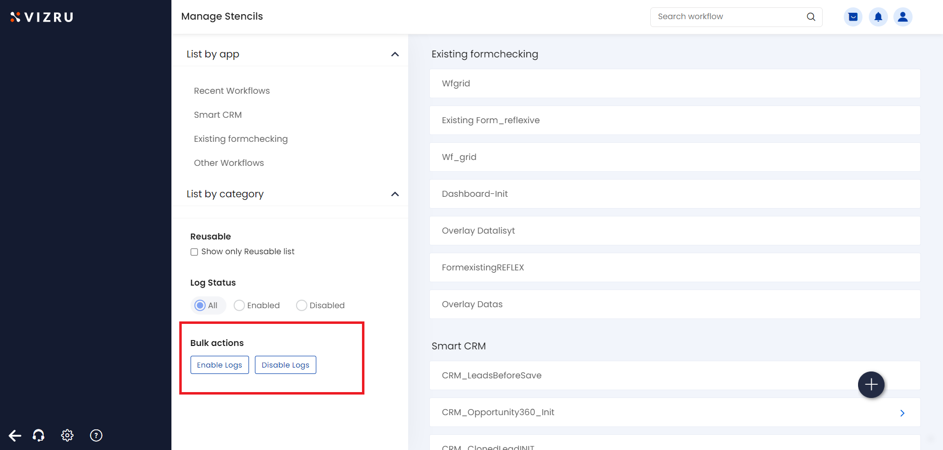
- Workflow log bulk action: Now you can enable or disable workflow logs as a bulk action. Also, you can enable or disable the workflow logs specific to an app.

To learn more about workflows, click here.
2. New parameters added to log view of File management blocks: new parameters have been added to the log view of file management blocks.
- For Copy File block, the output parameters are livespace id, file id, collection id, new livespace id, and new collection id.

- For Move File block, the output parameters are uid, lid, fid, cid, and newcid.

- For Download as File block, the output parameters are filename, action, filetype, charset, columndata, and outdata.

- For Delete File block, the output parameters are file-id, user-id, collection-id, and livespace-id.

To learn about File management blocks, click here.
3. New parameters added to Workflow Log of User Management blocks: new parameters have been added to the log view of user management blocks.
- For Add User to App block, the output parameters are email, lid, lidDropdown, and livespacerole.

- For Remove User from App block, the output parameters are email, lid, and lidDropdown.

- For Add/Edit User from App block, the output parameters are email, uid, hash, status, username, and federationId.

- For Deactivate User from App block, the output parameters are status and user email.

- For Set User Landing Page for App block, the output parameters are status, email, lid, and dashboard.

To learn about User management blocks, click here.
4. Design enhancements: A new design system is being implemented throughout the platform. Based on this new design system, the button style is changed under all components and the primary color of the button is changed to dark blue. The tile listing pattern of apps and dashboards is also changed.
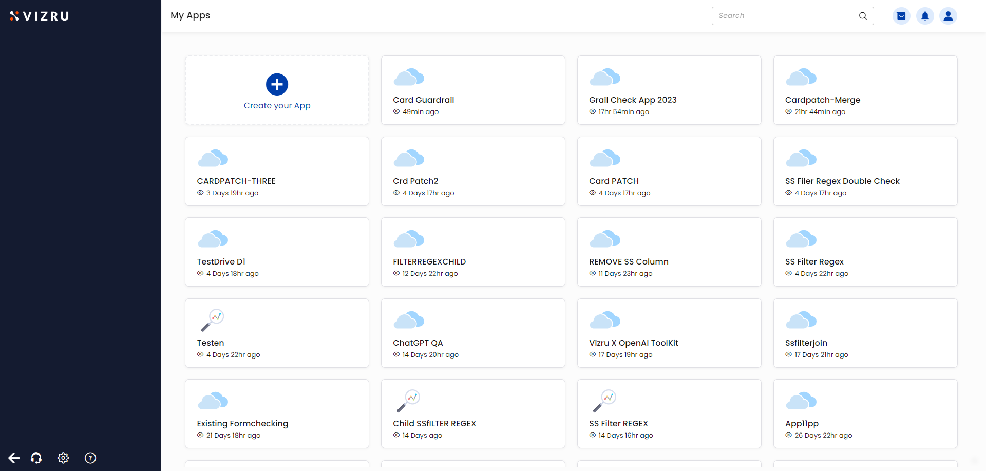
5. Dashboard Widget Marketplace: In the earlier version, you had a dashboard template marketplace that helps you to select any suitable dashboard for your app. Now you also have a widget marketplace to select a suitable widget for your app. To access the Widget Marketplace, go to Dashboard Edit.
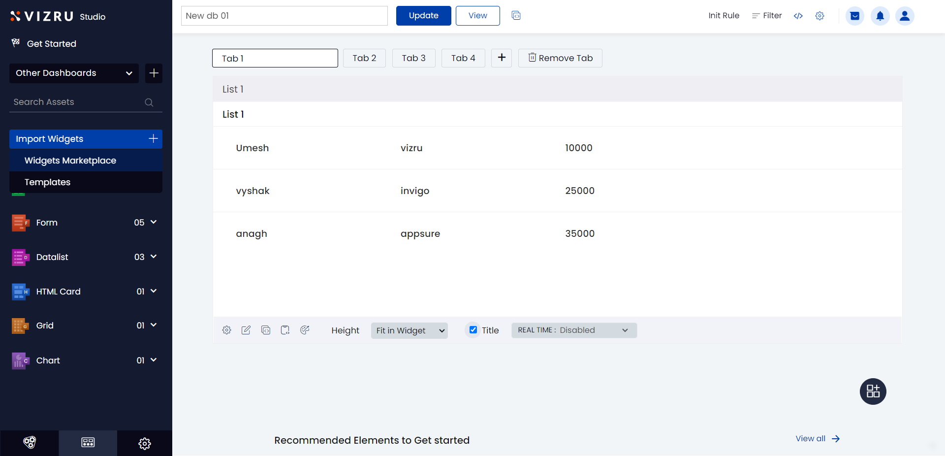
- Click Import Widgets > Widgets Marketplace from the left menu.
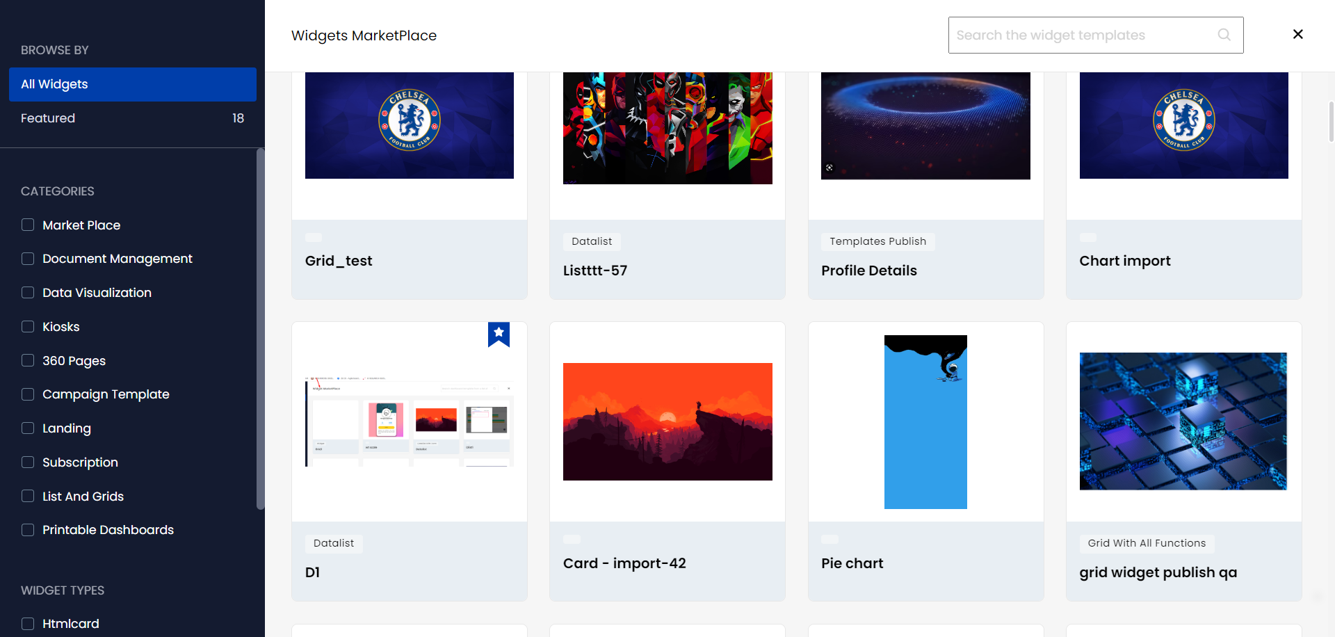
- Click the widget you want to use. The Widget Preview page is displayed.
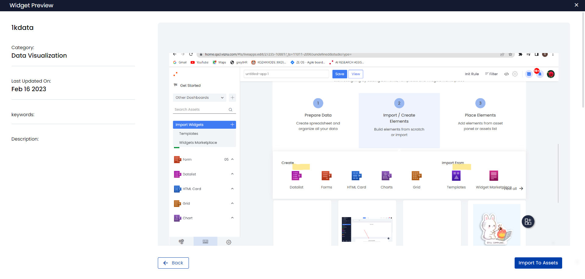
- Click Import to Assets. The imported widget can be viewed under the respective element in the Assets Panel in the left menu.
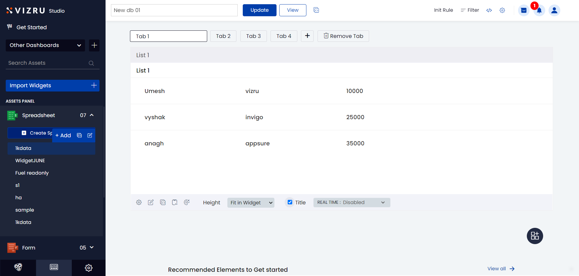
- Hover your mouse over the imported widget and click Add to add the widget to the dashboard.
You can also replace a widget from a dashboard template. For this, select the widget you want to replace, go to the Assets Panel, hover your mouse over the widget you want to add and click Add. The selected widget gets replaced with the new widget.
To access or import these apps, dashboards, and widgets, you must set the storage location in your tenant as apps.vizru.com from Settings > Configure Policies > Menu > App Publish Storage Location. To learn about dashboards and widgets, click here.
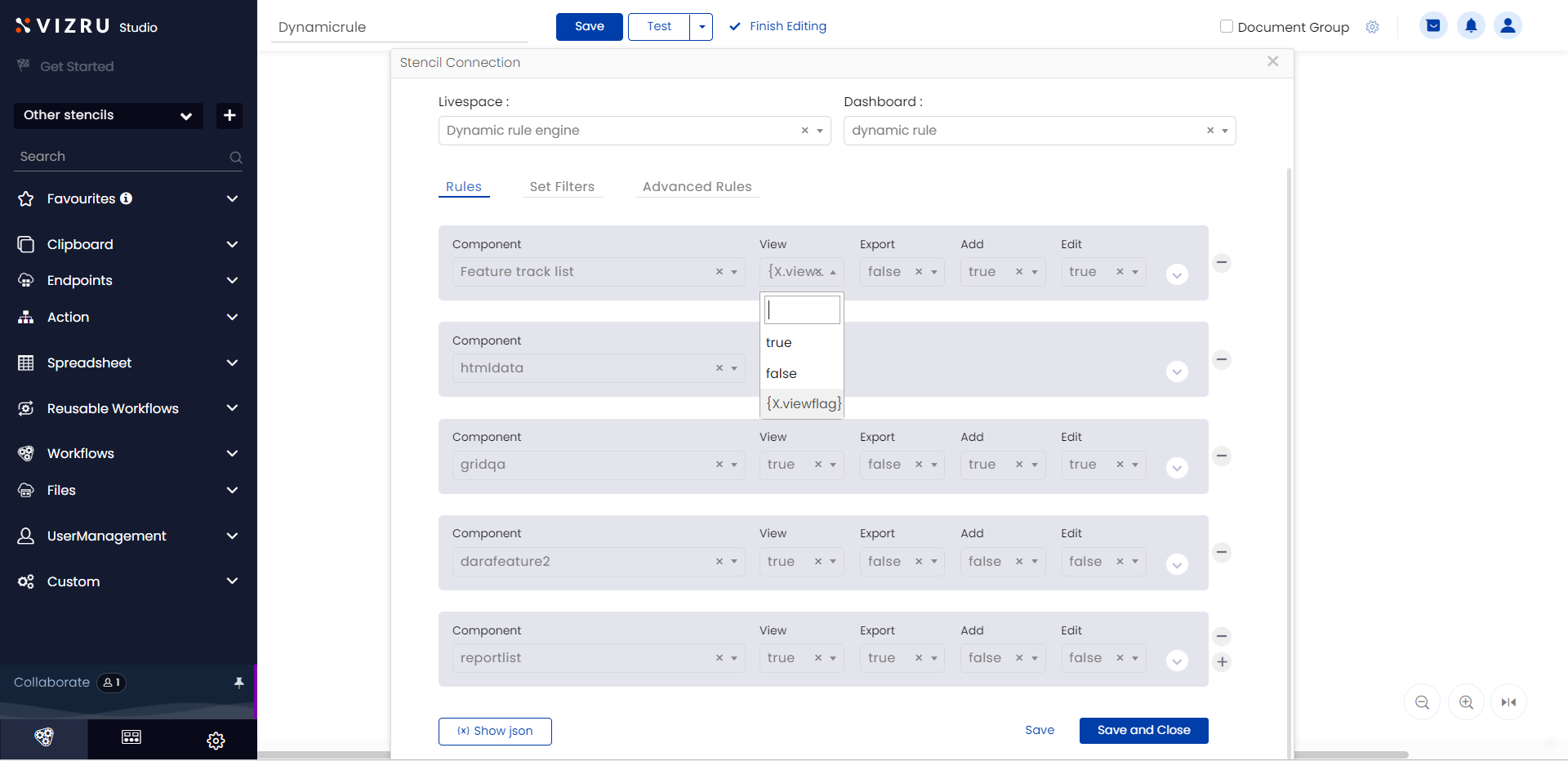
6. Setting dynamic values in Dashboard Rule Block – This feature is implemented to support dynamic values in the Dashboard Rule Block. You can now provide dynamic values to the Where, Group by, and Sort by options as well as to the Set static variable and Hide tab actions in the Dashboard Rule Block. Instead of checkboxes for View, Export, Add, and Edit actions, you now have a dropdown list from which you can choose the action as True or False, or get the appropriate value (either True or False) dynamically from a previous block.
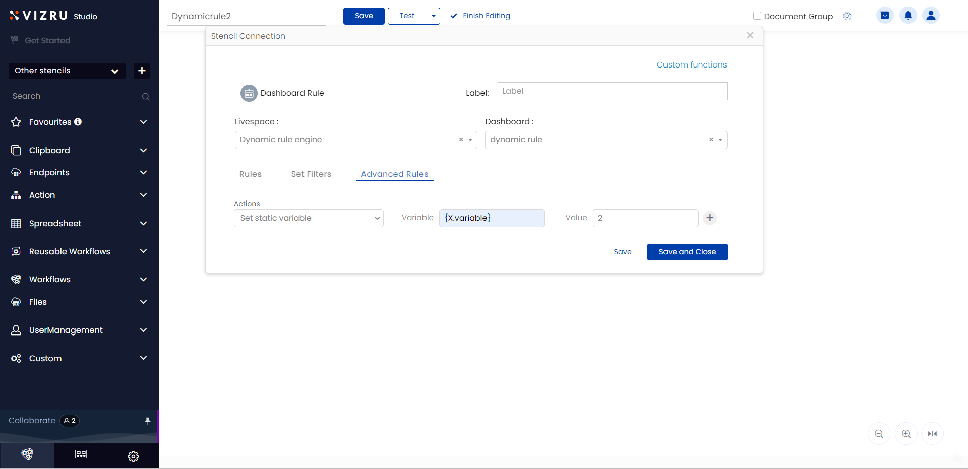
For the action Set static variable under Advanced Rules, you can set the variable name also as dynamic.
Additionally, a Show JSON button has also been added to the block to show how the configuration has been saved in the backend.
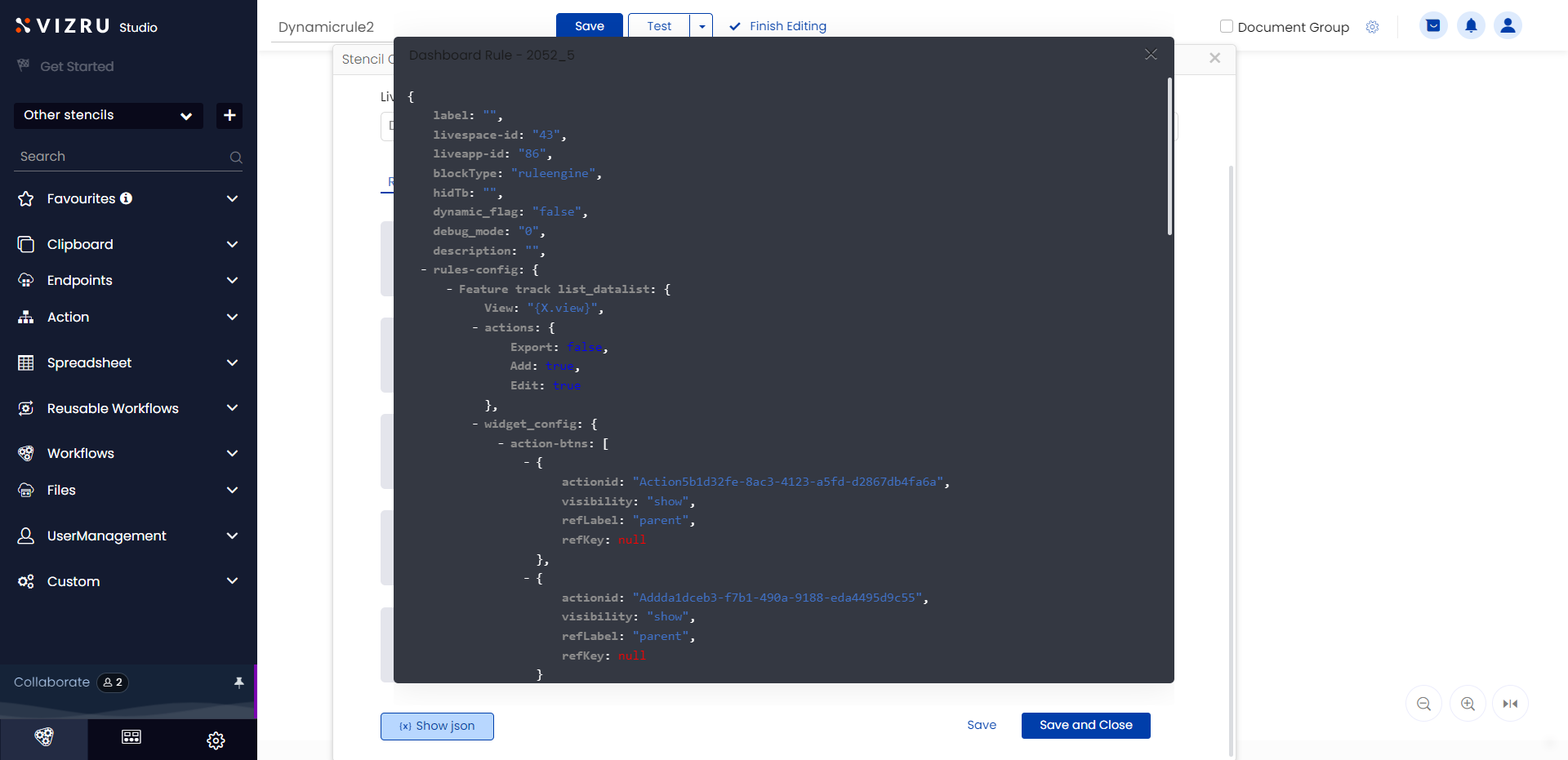
To know more about the Dashboard Rule Block, click here.
7. Dynamic value for notification type in the Notification block – Now you can provide the value Success or Error dynamically to the field Notification Type in the Notification block.
8. Displaying confirmation window using workflow – Now you can overlay a confirmation window using the Custom Output block. In the Custom Output block, select the Output Data Type as JSON and enter the required format for the confirmation window in the field Output Data – specify the action as “Confirm”, specify the height, width, title, content, and button style for the confirmation window, and provide the workflow shortcode corresponding to the action that needs to be triggered. The Custom Output block will convert this data to a confirmation pop-up. This eliminates the need to build HTML cards and call them as overlay for pop-ups.

To know more about the Custom Output Block, click here.
9. Identifying databases having a particular ‘string’ as their header column using Developer Tool: A new functionality has been added to the Developer Tool where you can enter any string, select an app, and the function will return a list of spreadsheets having the given string as header column in the selected app. To learn more about developer tools, click here.
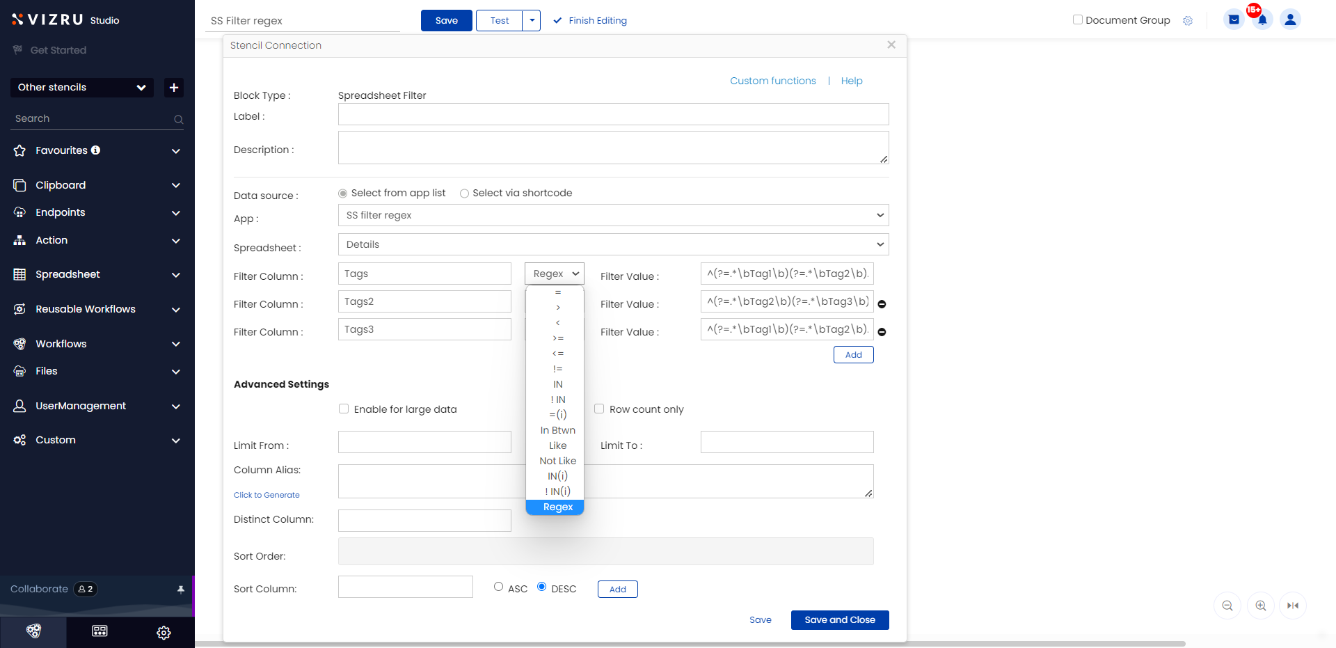
10. New Regex operator: A new operator “Regex” has been added to spreadsheet blocks, Dashboard Rule block, and Datalist Builder. You can select the Regex operator and enter a regex pattern to extract the required data. This is useful for tag-based or keyword-based file search.
11. Option to select multiple patches and download as Excel file – You can now select multiple patches from Update History and download them as an Excel file. This file contains the list of all the elements added or updated in each of the patches.
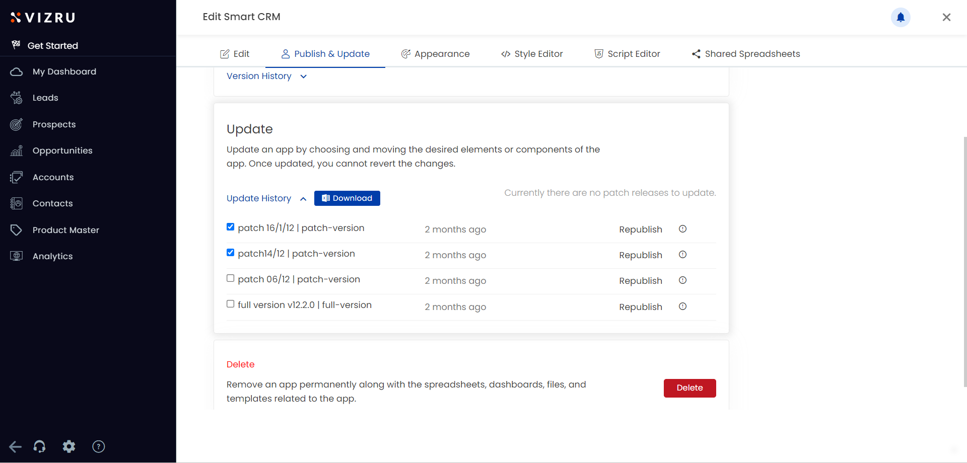
To learn more about patch releases, click here.
12. Improved Form Builder – You now have a Form Builder with improved UI and enhanced functionalities.
- The datatype of the fields is displayed next to each field.
- Dynamic form title: You can give three different titles to a form – main title which is given on creating a new form, form title to be shown in Edit mode, and form title to be shown in View Only mode.

- Form preview: You can now find the preview of a form by clicking the Preview button on the top right of the form builder.
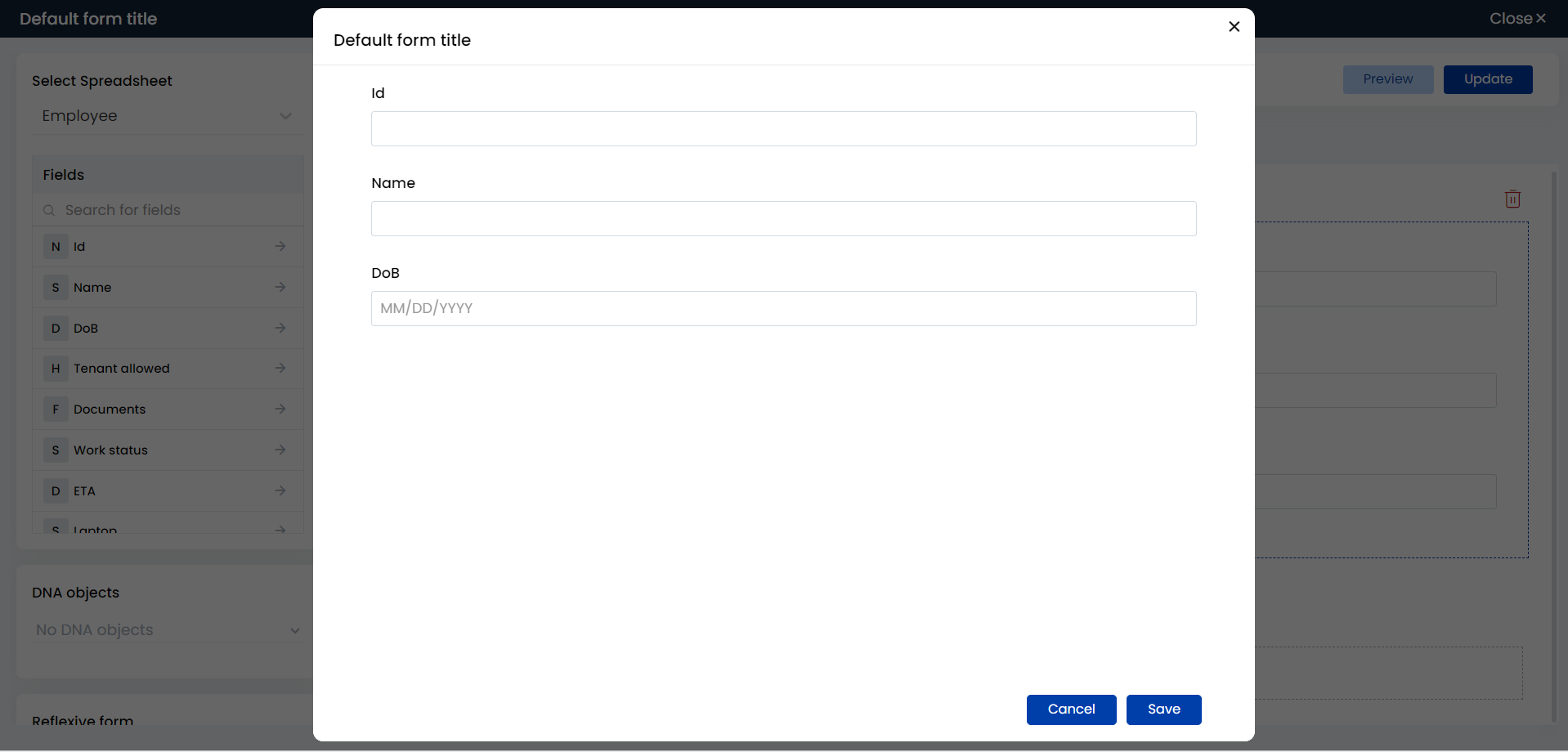
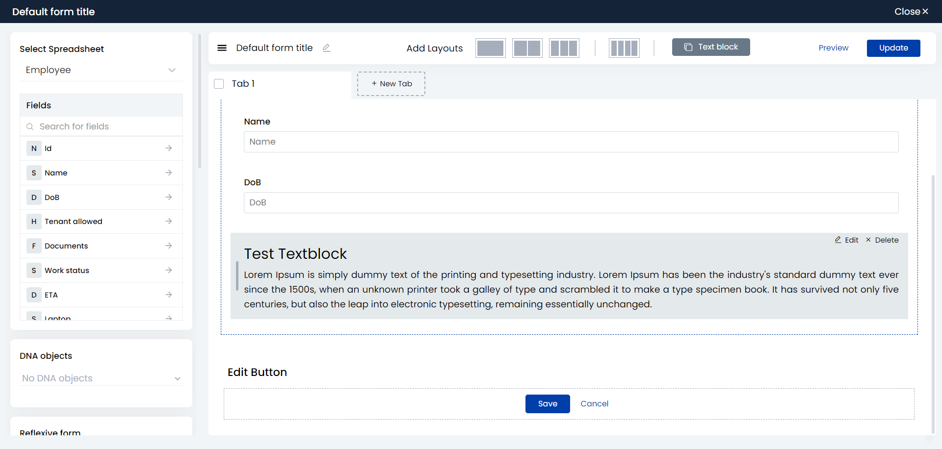
- Text block: You can add a text block to the form to enter multi-line text.
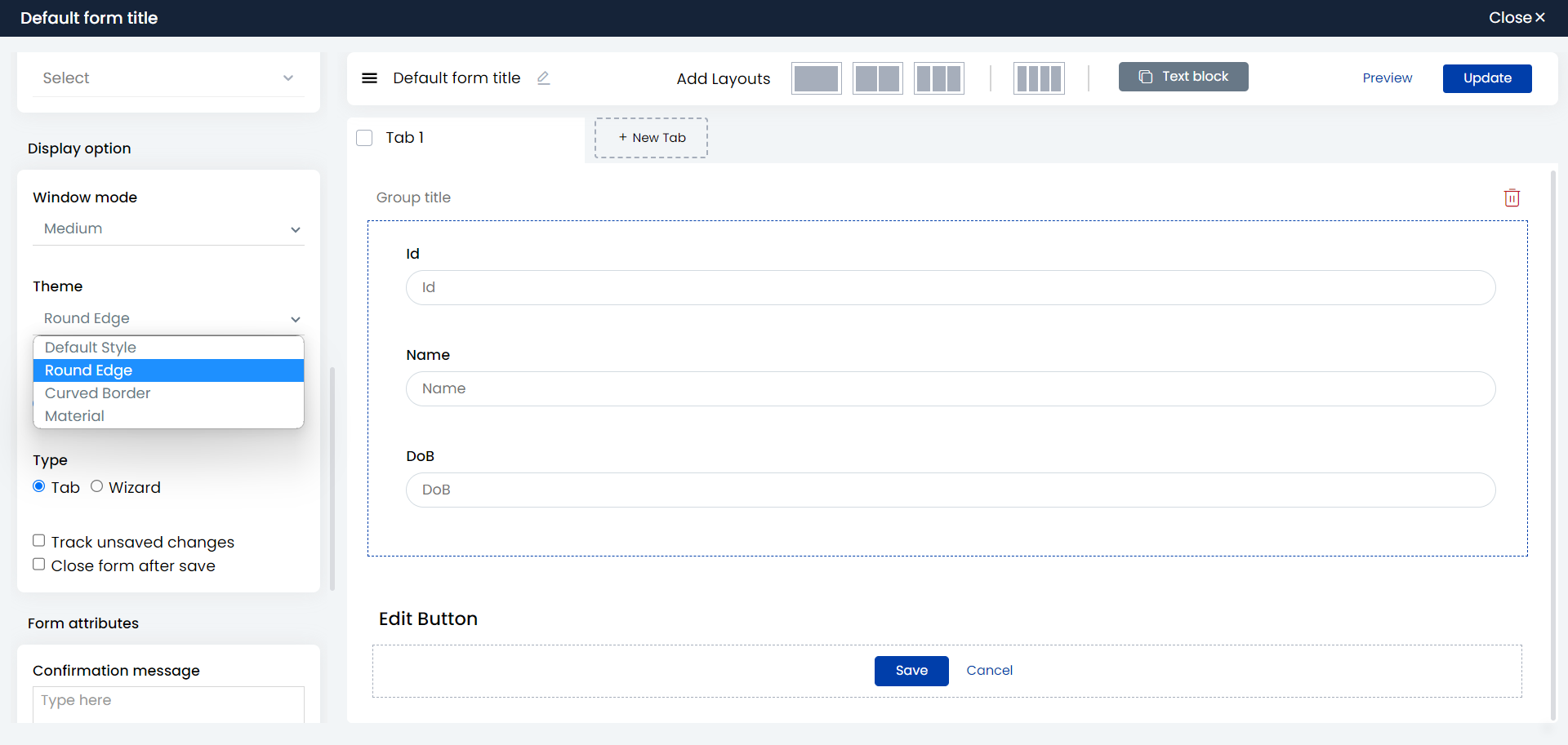
- Theme: You can set a theme for the text area of the field.
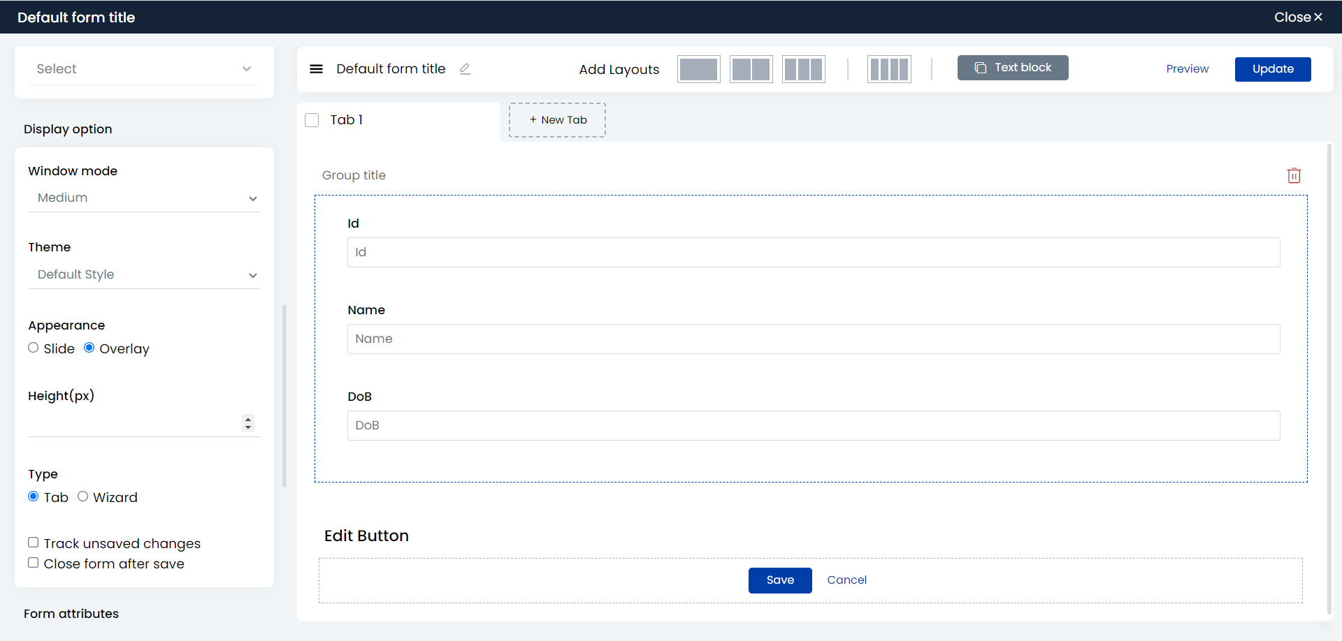
- You can specify the height and customize the size of the form overlay.
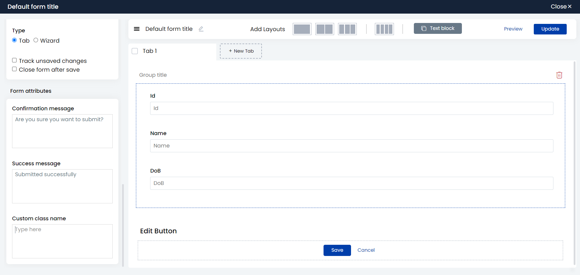
- You can specify the confirmation message and success message to be displayed on submitting the form directly on the form builder page without using any workflow. You can also add custom scripts to style the form.
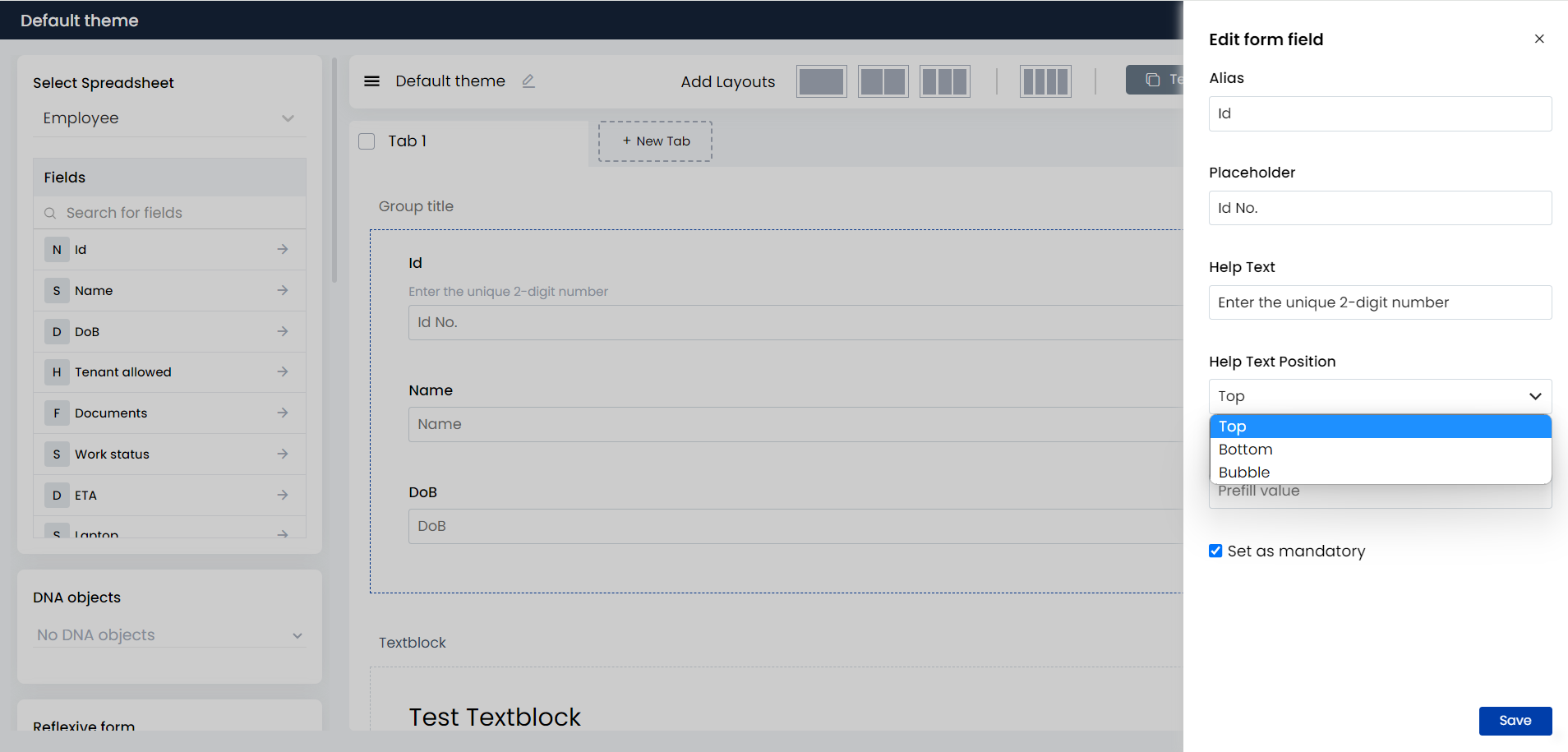
- Form field edit options: If you hover your mouse over a field added to the form, you can find the edit icon for the field on the extreme right. You can give an alias name, enter placeholder text, enter help text and set the position for the help text, and also set a default value for a field in the form. You can also set a field as mandatory by selecting the checkbox for Set as mandatory. The form field will have an asterisk symbol indicating that the field is mandatory.
- Field dropdown: You can set field dropdowns as normal, smart – where a datalist is displayed as a dropdown, radio buttons, or checkboxes.
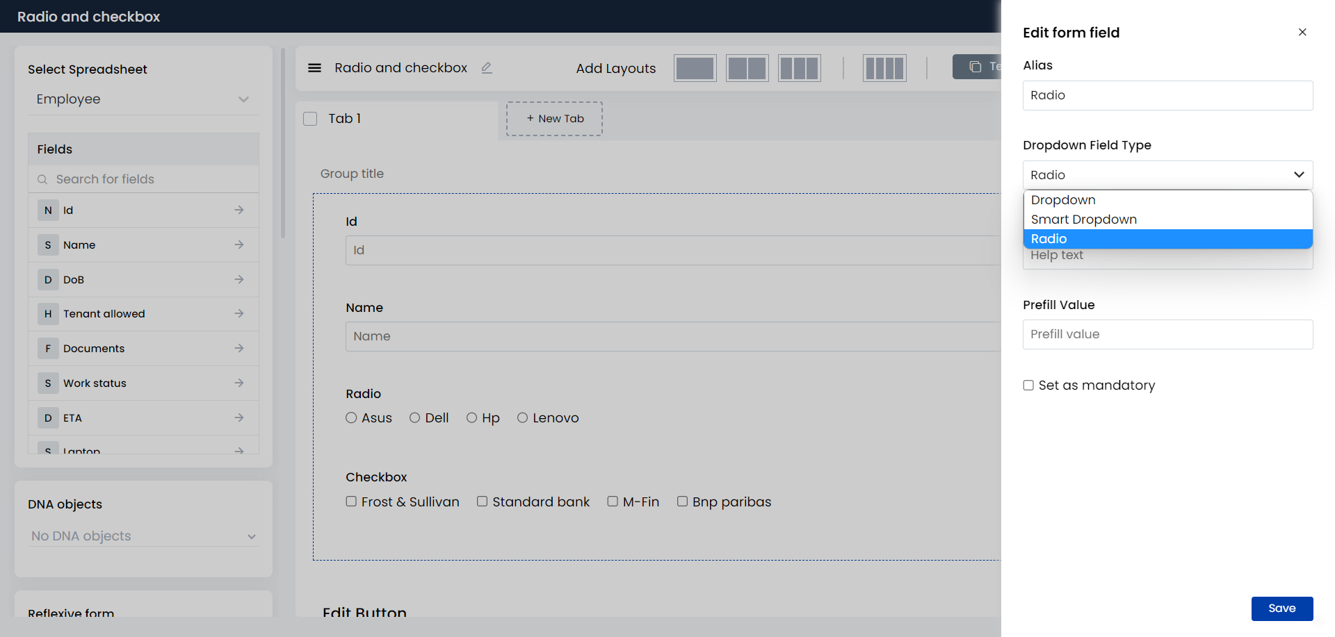
To display checkboxes, go to the source spreadsheet, select the dropdown column, and select the checkbox for Multiple from Column Settings.

To know more about smart dropdowns, click here.
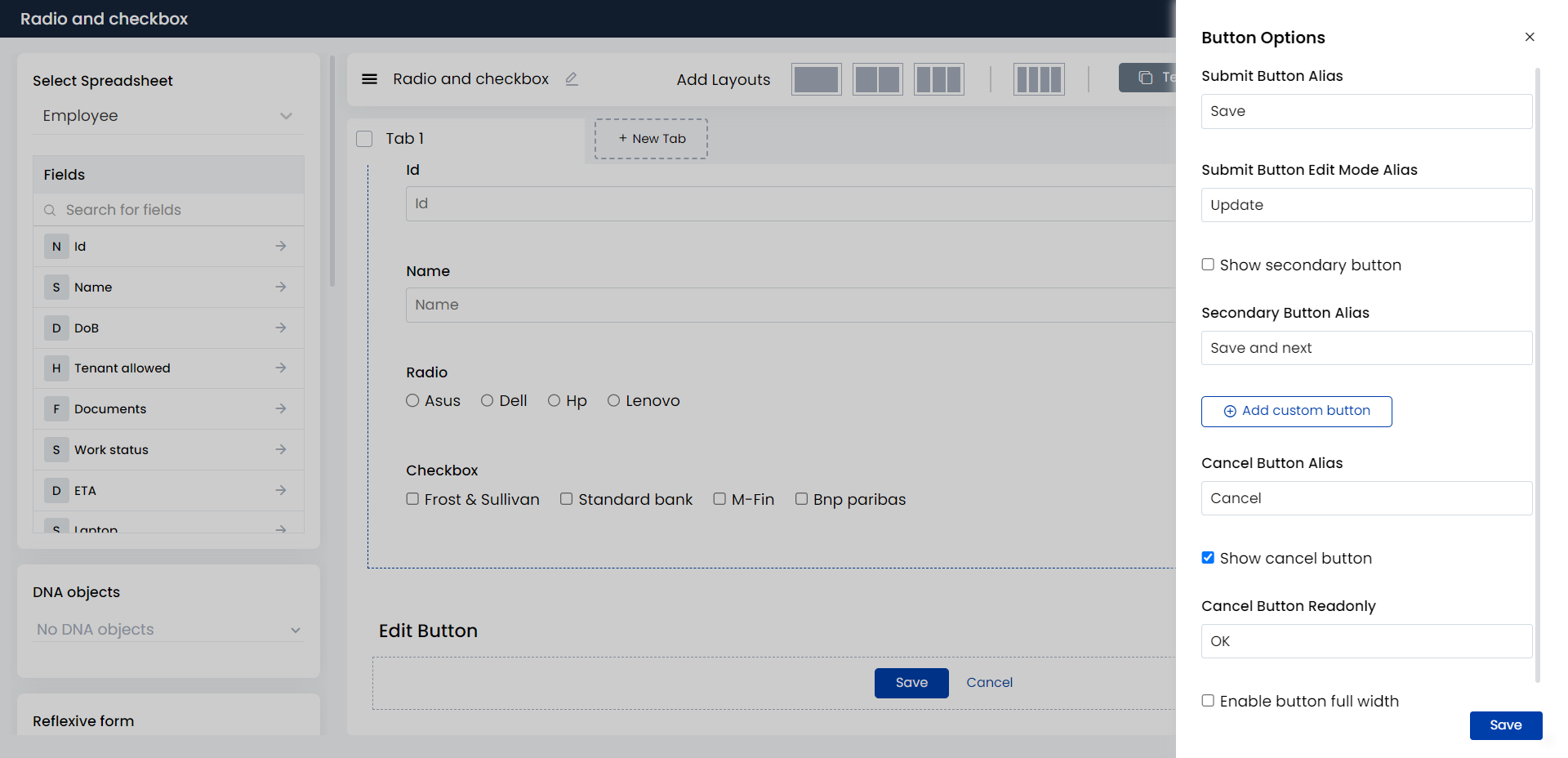
- Buttons: You can set alias names for buttons and add/delete custom buttons.
To learn more about forms and form settings, click here.
13. Added unicode encoder/decoder block function: Now in the String Processor block, you have four new functions added – Unicode escape, Unicode Un-escape, URL encode, and URL decode.
Unicode Un-escape
Input: \ud83e\udd74
Output ::
Unicode Escape
Input : :
Output :\\ud83e\\udd74
URL Encode
Input: https://www.amazon.com/
Result: https%3A%2F%2Fwww.amazon.com%2F
URL Decode
Input: https%3A%2F%2Fwww.amazon.com%2F
Result: https://www.amazon.com/
To learn more about the String Processor block and other utility blocks, click here.
14. Updated CKEditor version from 4.8 to 4.21: CKEditor has been upgraded for advanced text editor options.
Bug Fixes
- The issue of headers missing in datalist is fixed.
- The issue of form reflexive read-only not removed when sub filter is applied is fixed.
- The issue related to sign URL in background workflow is fixed.
- The issue with Custom Output block JSON structure is fixed.
- System created livespace list issues are fixed.
- New icons have been added.
- Chat POST Message socket changed.
- Bug related to design system implementation is fixed.
- The issue with removing ss column is fixed.
- Datalimit issue on HTML card for empty ss case has been fixed.
- Throwing invalid HTML error while using text inside double quotes is fixed.
- While using =(i) operator in the init rule block, not getting the expected results in HTML cards is fixed.
- Issue while copy-pasting patch summary Excel sheet data to a new Excel sheet is fixed.
- The issue while downloading a patch – in the excel sheet it was not mentioned if the ss is moved with or without data – is fixed.
- Bug related to Version history delete is fixed.
- Issues while removing default livespace are fixed.
- Bug related to File Delete Block is fixed.
- The issue of Cloud service breaking when connected as a child WF inside a Background WF is fixed.
- The issue of details missing in app settings is fixed.